Every month for 2018 the reddit /r/dataisbeautiful is hosting a data visualization challenge! Each challenge features a new dataset that users get the chance to be creative with, all for a chance to earn “Reddit Gold”. To my delight, February’s challenge was all about same-sex marriage in the US! A dataset originally from Pew Research Center contained the legal status of all …
No Homophobes
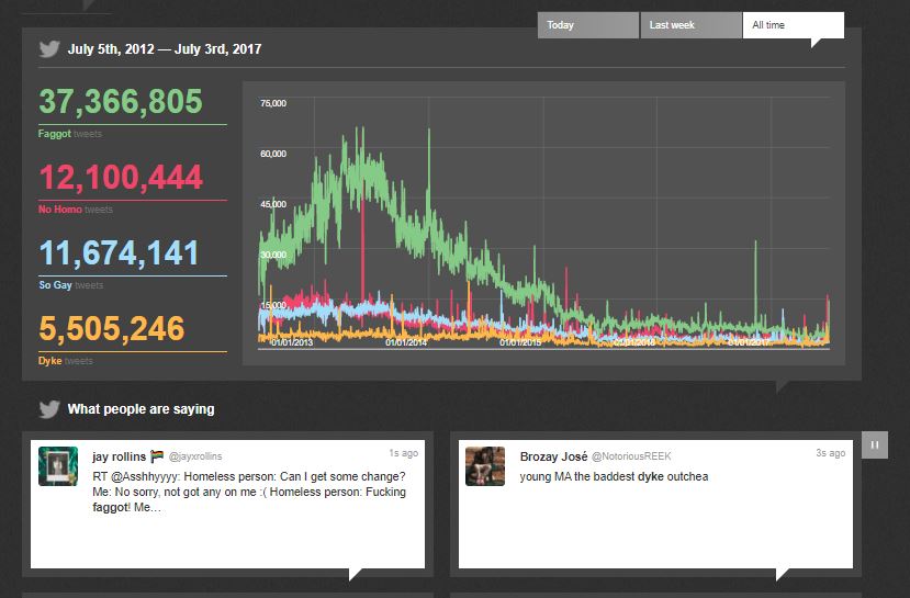
Another awesome gay data viz that deserves a shoutout! NoHomophobes is a project out of University of Alberta’s Institute for Sexual Minority Studies and Services that has been tracking homophobic language on Twitter for years now! The interface features a real-time counter for 4 homophobic terms, a scrolling ticker for the actual tweets (some are really hateful, be careful), and …
Gay Rights, State by State
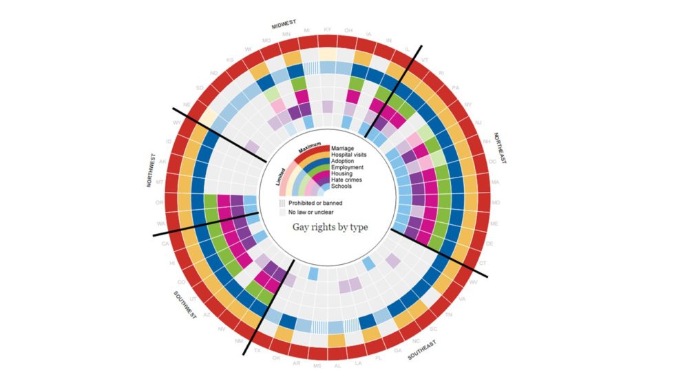
Aka the visualization that shaped my career. So The Guardian has this page that tracks gay rights in the US by state. It is a 100% awesome. Colored chunks for different kinds of rights, states are grouped so regional patterns are apparent, interactive hovers bring up additional information about the state’s legal environment. Hours of fun people! Awesome interactive visualizations …


