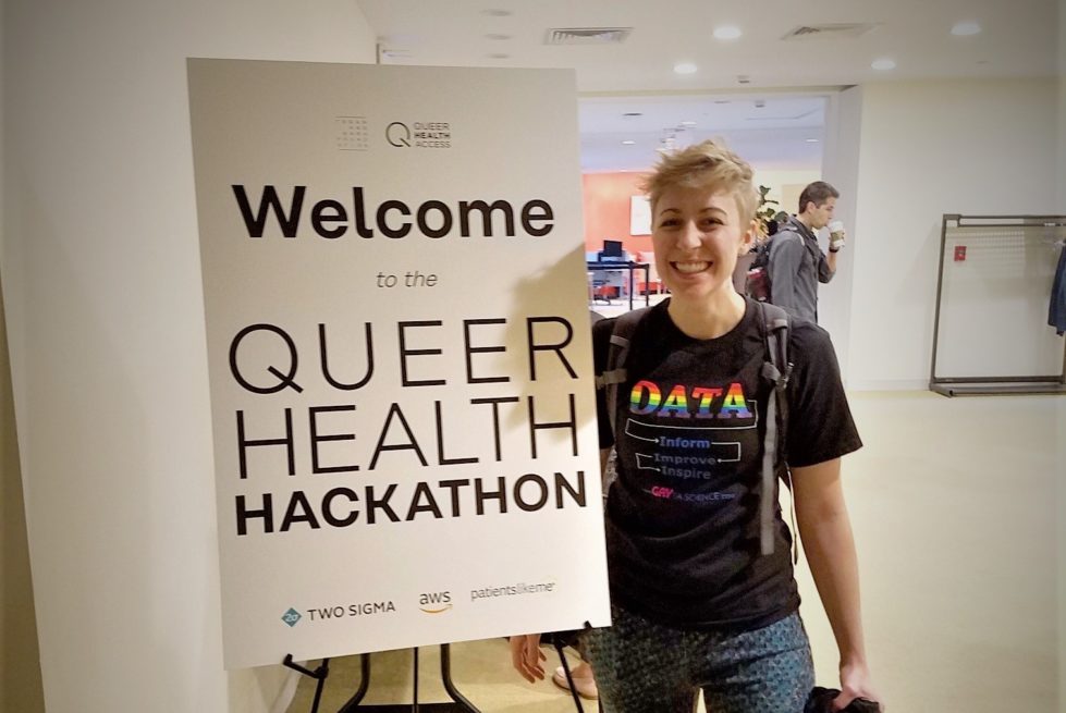
Last month the Tegan and Sara Foundation put on an event that literally felt like all my interests came to life. The Queer Health Hackathon brought together data scientists, health providers, and policy experts to better understand health disparities in the LGBTQ+ community. I was invited to join 75 tremendously smart, talented, and passionate individuals in Cambridge, MA for an …
DRAGNET EPISODE 1
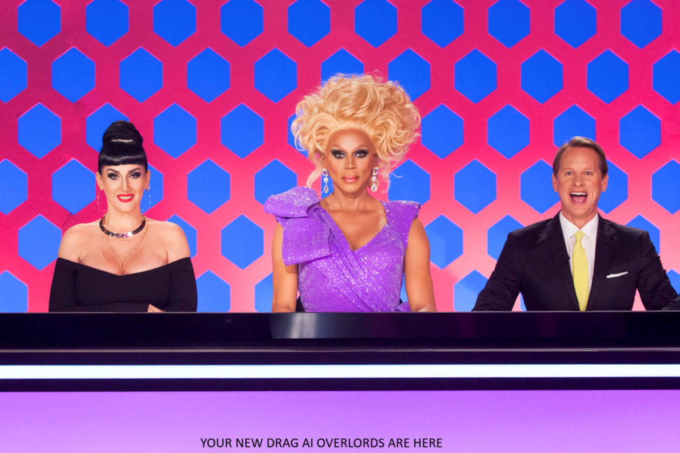
This is the BeginningRupaul’s Drag Race is my favorite show of all time and as a data analyst it’s always been my dream to use data about the show and queens to make observations about the shows contestants and predictions on their performance and castings. I knew that this had to start with the data, making it clean and accessible is the …
Let’s talk about Corporate Pride
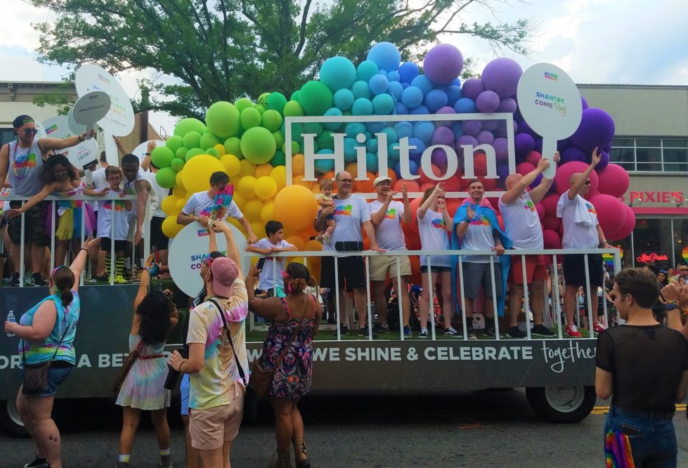
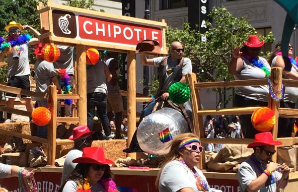
Last year I wrote a thing about how Pride is getting less fun, because corporations. I proved this using 7 years of Pride parade data from a large city in the northeast U.S. I just updated my dataset with the 2018 data, and things have gotten even worse… I was shocked in 2017 that a third of the parade was …
Plotting Pride SOGIE’s!
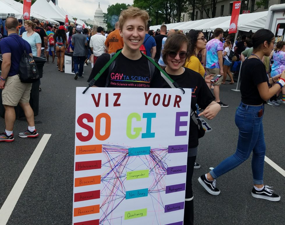
A couple of us on the Gayta Science team decided to take the show on the road this past weekend! We hit DC Pride with the goal to create a collective data visualization of people’s SOGIE’s! SOGIE is an acronym that stands for Sexual Orientation, Gender Identity, and Expression. Which means that EVERYONE has one, whether they are gay/straight/trans/cis/in-between/whatever! We …
Visualizing state-sponsored homophobia
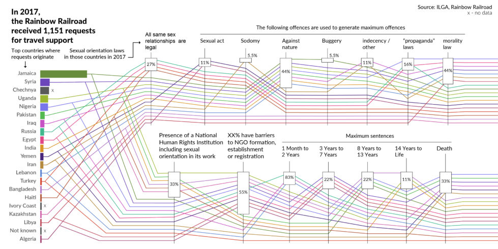
LGBTQ+ people around the world face state sponsored violence, ranging from laws against promotion of LGBTQ+ identities to laws prohibiting non-heterosexual relationships. To take stock of the specific laws people must face in different countries, the International Lesbian, Gay, Bisexual, Trans and Intersex Association publishes a world survey of sexual orientation laws, the State-Sponsored Homophobia report. Endangered by these types of laws (and other factors), …
Same-sex marriage /r/dataisbeautiful
Every month for 2018 the reddit /r/dataisbeautiful is hosting a data visualization challenge! Each challenge features a new dataset that users get the chance to be creative with, all for a chance to earn “Reddit Gold”. To my delight, February’s challenge was all about same-sex marriage in the US! A dataset originally from Pew Research Center contained the legal status of all …
How much of Pride is for me?
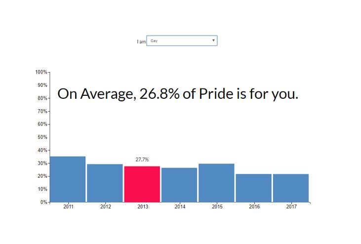
The LGBTQ+ community is very diverse – in terms of race, ethnicity, ability, class, religion, you name it. It also includes a wide variety of things – sexual orientations, sexualities, sexes, gender identities, relationship arrangements, and more. As inclusive as the community is in theory, how much of this is actually reflected in Pride celebrations? Like previous posts have explained, …
Company Call Outs
Previously on data confirms things we already know, it was revealed that Pride is indeed less fun these days – mostly due to it being taken over by corporations (as well as other not-so-fun entries like politicians and religious organizations). As shocking as this wasn’t, I wanted to focus in on this corporate aspect and explore it a little more. …
Pride is Less Fun
So, I’ve had a long standing theory that Pride celebrations have gotten less fun over the years. It seems like every year I spend more and more time pity-clapping for a clearly uncomfortable and stuffy politician or dodging the growing army of HRC volunteers who “just need a minute of your time”. In an attempt to gauge whether this is …
No Homophobes
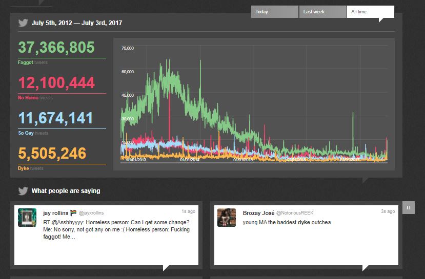
Another awesome gay data viz that deserves a shoutout! NoHomophobes is a project out of University of Alberta’s Institute for Sexual Minority Studies and Services that has been tracking homophobic language on Twitter for years now! The interface features a real-time counter for 4 homophobic terms, a scrolling ticker for the actual tweets (some are really hateful, be careful), and …

